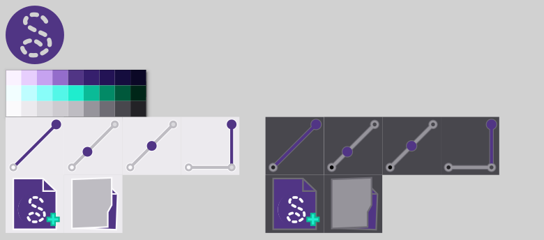
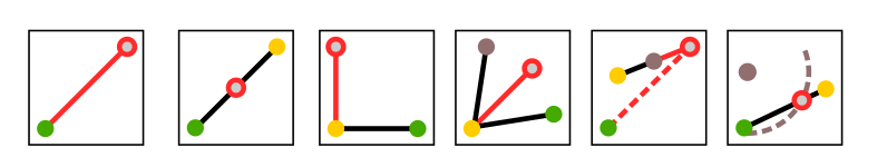
I would like to streamline the iconset and make some icons more “readable”. With the different point tools I would like to see in the icon which point to click first. So I modified some icons to show you guys my idea.
Start/First point: green
Nextpoint: yellow, dark grey, …
End/Result: red
What do you think?
So how does this color scheme fit the current scheme? How will it fit a future dark scheme? How does the Red & Green work with someone who has Red-Green color blindness? IMO too many colors… to the point it’s distracting.
@JCDesign used a different shape for the red dot, which should be enough to accomodate color bilnd people? In any case, this idea of colors is just a small extra to help people understand the tools, it’s not “necessary” to use the tool, so it shoud be ok in that respect, don’t you think?
I understand, but I think it could be of some help because some tools like the “Length to line” are not that easy to understand for beginners
It could be a good way to explain the tools in a small “help” popup or a help menu inside the software, but it’s definitely a whole other thing to do, and a lot of work…
True. But in that respect having those explanations directly inside the software, through “help” popups, of a simple help “F1” menu could be a great improvement to Seamly for the future.
Kinda getting off topic… but that’s where implementing help through the Qt Help framework is the way to go. But who’s going to do it?
That being said my suggestion if one wants to start changing all the icons, figure out how to use the Qt Style sheets and create themes for the tool icons. That way a user can have a choice… including a dark or “classic” theme.
I agree, that there should be one colorscheme. Can we get the existing colorscheme from the repository?
That beeing said, the existing icon set differes from style and coloring, which could need a rework.
I absolutely adore this idea, but I do agree with some of the comments that it might need some finessing.
My reasoning for why I would like to see this employed is a combination of UX and efficiency. This is not an easy CAD program to learn, though, by no means is it the hardest (I’m looking at you Solidworks). While I have been using Seamly for several months now, I still am not very familiar with all of the tools. I have a general handle on the theory of the program, but I continue to require instructions leading me through the use of some of the more involved tools that I don’t need as frequently. Right now, that is obtained through the prompt provided at the bottom of the screen. Great. But on my 4K screen, that’s awfully small text, awfully out of the way of where I am working.
Having those instructions proffered as part of the icons would not only help me to learn the sequences faster by having a pictorial reminder but would, in-part or in-whole, eliminate the need to glance down at the prompts, saving time. A second or two individually doesn’t mean much, but with how many steps (or rather uses of tools) it takes to make patterns in Seamly, the time saved would really add up. This is also why having to regularly reference a manual in order to recall the process required for tools with more steps would just be godawful. As Home Assistant has recently been learning, the more information provided in the UI, the easier a time the users have.
I also heavily favor the ability to customize color schemes and themes (I’d kill for a dark theme to save my poor eyes). There’s actually a lot of customization I’d love to see added in some day, but I’m patient enough to wait. If nobody gets to this in the next couple of months, I may try my hand looking into the program to see about themes since at that time I should have more time to learn new things.
I get what you are saying about the tooltips being a bit hidden at the bottom in a very small font, however, it’s what is available without detracting from the size of the drawing board, at this stage. We are looking into other options but first, the whole program needs to run exceptionally smoothly and, if you’ve been through the forum, there’s one tool that I totally avoid, which is the Union tool in Piece mode. This tool is currently being totally rewritten as a first priority, which is taking time.
As for the dark screen, etc. they are on the list of todo’s on Github.
In the meantime, what helped me when I was starting out was that I made a Tooltip document, printed it & laminated it, & stuck it up above my computer screen. When I was looking for a tool to use, I could glance at it, choose a tool that I thought would work, & had a more detailed instruction to use the tool. Here’s is a copy of the one that I created, which is hugely outdated (@Pneumarian did create a more updated one a while back, but I can’t find it now):
Hi, @Grace, thank you for the advice and the cheatsheet.
I’ve been lurking around the forum for as long as I’ve been using the program (it’s been very helpful), so I understand that there are a lot of things that are being worked on and improved, slowly but surely. I’m patiently waiting for the unfortunately-lost symbols tool to be written again and implemented, and I very much look forward to the Union tool actually working someday.
I realize that this change would be considered low priority for the main developers, but I just wanted to add my endorsement and reasoning to the idea. I figure that it will turn out to be a race between this idea (possibly) actually being implemented and my memory simply kicking in through long term use to achieve the efficiency that I hope that this color-coding would provide.
At some point when I have the time to work through it, I would be interested—and it would probably be within my capabilities to learn—to see if I couldn’t get this and/or the themes going. If this idea is ultimately rejected, I’ll probably just end up forking the repository to make a few permanent changes that would better suit my personal needs and preferences at some point, anyways.
I’d like to see the color scheme based on a blue compatable with the system UI. That’s why I was changing icons to use the blue. Like in Windows.
Other wise your going to have blue with all the system icons, and purple with your’s… Unless like I suggested we implement custom style sheets for the system UI, and custom icons for the Seamly icons. Which, again IMO is the way to go. That way the apps could be color schemed where you could have a purple scheme, I could have a blue scheme, or others could have the current if you will “classic” look.
BTW… I’m not sure if you’re aware (most) all the toolbuttons and icons are already in SVG format in the repo?
Thank you, @JCDesign, I see my suggestion of the lavender-purple of the Seamly icon and I like the cyan colour which shows up really well on both dark & light.
Hmmm… yes. I was thinking of something that will show well against both dark & light screens, that went in with our theme both in the software and here on the forum.
I’d like to see the color scheme based on a blue compatable with the system UI. That’s why I was changing icons to use the blue. Like in Windows. Other wise your going to have blue with all the system icons, and purple with your’s… Unless like I suggested we implement custom style sheets for the system UI, and custom icons for the Seamly icons. Which, again IMO is the way to go.
I can’t find any WIndows standard icons in Seamly?! Nevertheless, I like the idea to have the possibility to change the color theme in the application
BTW… I’m not sure if you’re aware (most) all the toolbuttons and icons are already in SVG format in the repo?
Thanks for the hint. I didn’t found them in the first place.
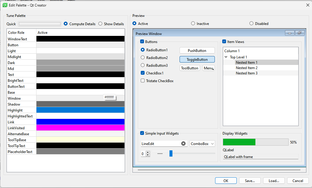
It’s more of things like checkboxes, title bars, toolbuttons, slider handles, etc. Which are based on the palette Windows is using. You can change the fixed app palette (or for that matter any individual widget) in Creator, but IMO the smart thing to do is have it dynamically loaded (along with a set of themed icons) so it opens the option for different cohesive color themes.
Of cource there’s also going to be the Windows color palette… which is where the style sheets comes into play to over ride the Window’s palette.
There’s several different places icons are stored. For the Seamly2D tool icons you’ll find the SVG’s in app/seamly2d/share/resources/toolicons/svg… if memory serves correct. I think other icon SVG’s are stoted in the libs/misc/share/resources/…