Icon suggestions
I would like to make a suggestion to modify the icon:
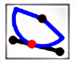
“Intersection Point of Line and Arc (PC).”
to something like this :
The current icon made me think it had something to do with a tangent, even thought there is a tool for dealing with tangents, called: “Tangency Point of Arc and Tangent (AT).”
4 Likes
Or even if the original black line were just flipped up along a horizontal axis anchored to the red point.
OH! I think that the biggest thing, for consistency across tools, would be to make the blue arc dotted instead of solid. That alone would make it more obvious that it’s not the same as “Tangency Point of Arc and Tangent.”
Let’s see if I can find the master pic in the Source… Aha! A little bit of Inkscape magic, &:
 or
or  or
or 
Many thanks to Voncarlos for the inspiration!!!

4 Likes
Yes !
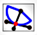
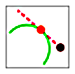
I like the second one. But making the axis line dashed in blue.
Like this:

4 Likes
The red dot under the line is a 4th point that isn’t involved, can we leave it out?
2 Likes
My alterations were made using Pneumatian’s drawings, and I’m not sure what the pink color indicates.
I have gone back to the manual now and reread the description for the Black and Red dots.
So something like this?

You got it Pneumarian
2 Likes
That was me getting carried away trying to make it look more like the actual draft, until I realized that trying too hard would just make it less clear. I assume colors will need to change before it’s implemented.

1 Like
I like this because it visually shows that the radius of the dotted blue arc is the controlling factor of where the intersection will be, and we all know that the radius dimension is user controlled.
2 Likes
 ?
?