Combining the known and custom as you described sounds much simpler to me. Thanks again for all the good work you are doing.
2 Likes
 …
…
2 Likes
Two more GUI improvements I thought were:
- have a night mode in Draw mode. The white background is too bright (maybe a beige or night mode to a darker color)
- being able to print lines in the color selected in Draw mode (or have the option to add color to lines or patterns in Detail mode).
Best, Aline
2 Likes
Yes, and perhaps have the node labels in different colours, as well 
But one thing that I’d really, really like is to have nodes show up if I select one node, so I can see which ones use that node, line or curve in a formula 
2 Likes
Both are coming…
While not necessarily a “dark mode”, you’ll be able to select a background color. This one is going to require updating the pattern schema to allow more colors - specifically the greys.
Also will be adding colors to lines, (text) labels and pattern pieces in the piece mode as well as being able to add hatchings to indicate right / wrong side of fabric. This eventually carry over into layouts.
4 Likes
In other words a visibility by dependency mode.
3 Likes
On that. One dependency issue I keep having is forgetting that I’ve already traced a pattern piece using a node that I’m deprecating. Will there be something, maybe in the “Group” panel, that will show that a traced pattern piece uses that node?

2 Likes
How can I have this on my seamly, I need it so much!
2 Likes
Sorry, I Have succeded downloadding the last version, 6.0.2. It’s a different desk but it seems fabulous, going to try rght now!
2 Likes
I just pushed the changes a couple days ago that incorporates some of what’s in the image you posted - might be available in the next weekly update. What you see is from my fork, and bit by bit I’m adding features to Seamly2D.
4 Likes
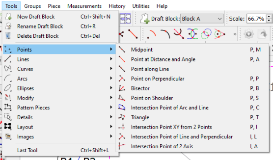
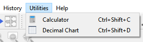
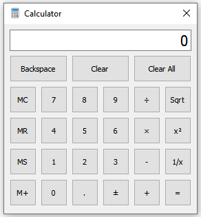
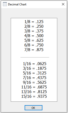
Resolved issue #308
Adds a Utilities menu with Calculator and Decimal Chart (inch fractions to decimal) items:
3 Likes
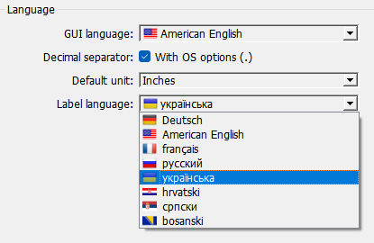
Since I am trying to fix the utf-8 issues with the label language strings, I noticed that the drop down box for the label language does not have the flag icons like the GUI language dropdown does. So I added them. ![]()
3 Likes
Hi, I can’t find any setting to make the general interface larger? Some fields and dropdown selections are very narrow. It is a little bit of a hassle to read them.
I can’t be sure if this is due to my Windows display with custom scaling on.
If you’d like me to post this as a separate issue on the forum, let me know and I’ll make a new post.
2 Likes
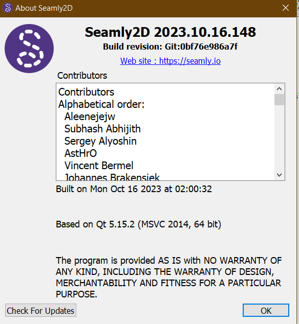
Hello, @zunzun
Please will you post a screenshot of Help > About Seamly so that we can see which version of Seamly you’re working with. Mine is a bit old, from 11/9/2023, & I’m on Windows 10. I don’t have the same problem as you are showing:
I’m having trouble finding a recent post/thread in which @Douglas described some of what he did to mitigate this issue, however as I recall it was left at still not being super great with custom scaling past a certain point.
![]()
2 Likes
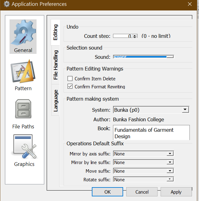
Could be. Setting the Windows scale larger than 125% is not recommended. Also you’ll want to have the most recent release. The Prefs dialog is one I specifically fixed recently that wasn’t adjusting properly to 125%.
This is the App prefs dialog @ 125% Windows scale with my current build…which is only ahead of the most recent release by some translations updates.
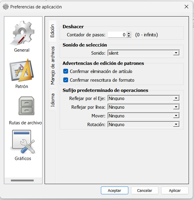
That being said… there may still be some dialogs that need some tweaking to adjust better vertically to >100% scale.
4 Likes
I am using the latest release on Windows 10.
Changing Windows scaling to 125% did improve the issue, so my previous custom scaling at 140% could indeed be the cause.
I guess I will just try and get used to this scale ![]() or get a larger monitor…
or get a larger monitor…
thanks for the assistance!
2 Likes
Unfortunately there’s only so much vertical space to work with, and when the system scaling gets to a certain point, something has to get squashed . Without putting all of the dialogs content in a scroll area - which would not be a fun proposition. Also once you start getting past 125% it doesn’t leave much work area unless you close the docks, which kinda makes the app harder to use - unless you learn the key shortcuts.
5 Likes