Crafting the First Mile

Continuing the discussion from Bug: Seam Allowance sometimes doesn't create "corners":

Links to the articles that @Douglas mentioned:

Thinking about it from this angle, as an industry outsider:

1. The startup zoom level is much too close. Your mileage will vary, but on my 22" (or thereabouts) screen, from point A to the furthest corner of the workspace is less than 3/4" & the closest edge (down) is too close to even make a new point (less than 1/10")

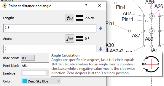
2. A tootip/help popup, or even a disable-able diagram, showing that angles’ 0° point is rightward would be lovely. Something to warn that the currently called “Point along perpendicular” is the only exception to that rule would also be good; at least :point_down:

3. Startup tips! A dialog of startup tips, that can be paged through in either direction, may be somewhat tired these days, but can be a nice way to give new users a moment’s enlightenment before they proceed. “Be sure to check the lower left window frame when using a tool for hints on how to proceed to use it,” or “Hold SHIFT to force a new point to be created at one of the eight main compass angles in relation to the originating point,” (That one needs a good editor,) might make a good first two tips. Some sort of warning/assurance about the easily accessible node-editing dialog should also be right up there at the top, probably before the Shift note.

4. Set apart usable tools from unusable tools. Maybe start with “Point at distance and angle” selected?

I think that about covers what took me months to get past my first 15 seconds, though since the closest I’d come to drafting previously was Dress Shop 2, (yay DOSbox, bleh DS2) a basic block or two would have been delightful.

& I think that that route should at some point be Seamly’s “First Mile”, but I also think that we might first want to bring in people familiar with the industry, in which case I am out of my depth.

2 Likes

Believe me… as an industry insider of sorts, and a user of all kinds of video, graphics, and CAD software - I’ve had my share of head scratching with the program. I’m glad I found that article Susan posted quite awhile ago - well before I discovered the program - as it along with his 15 second article reinforce some of my feelings of the program. In that it:

  1. Needs to conform to established design practices.
  2. It needs work to help new users get started using the program.
  3. It needs features to make it useful to those for sewing / garment design to keep them.

I can respond to this one right off the bat as I’m currently working on the Zoom updates.

Agreed. In testing I’ve started new patterns umpteen times and always need to zoom out to do anything… I just checked and the program starts zoomed into 1104.5%. when starting a new pattern. It’s due to the fact that when loading a pattern it zooms to fit the first draft piece of the pattern, but there is only a point when you start a new pattern. Doh. I will change that… In trying it out having the zoom set to 100% is giving me about 9 1/2-10" for a horizontal line. MUCH BETTER.

We could, and probably should start a whole topic dedicated to startup and help ideas. I know we’ve discussed a splash screen and startup settings, but off the top of my head what could really be useful is a short 5min video of how to get started with the program that can be watched from the splash screen.

2 Likes

Another small thing… When I first downloaded Seamly, way back, I seem to recall that it came with a sample measurement file and a sample mens shirt pattern (I could be wrong and have gotten them elsewhere). But I do think a very basic women’s bodice and .vst would be great to be included in the program package so that a newbie could do some playing around to get the feel of the programs versatility and actions after watching the 5 min video, before having to start drafting from scratch or searching for hours to find something to test on.

Correction: Seamly only comes with a .vst file (GOST_man_ru.vst) not a pattern.

2 Likes

There’s the (Timo) mens shirt and pants pattern… but they’re in a resource folder and don’t end up in a build distribution. Should be simple enough to move them into the pattern and measurements folders. And yes, a simple women’s bodice pattern would be a good idea.

And of course one ends up finding the panty pattern video. Lol

2 Likes

Yeah. As I recall, it does an admirable job of presenting the basic capabilities & use of Seamly, but I think a PJ pattern video might be more socially responsible to include as an official introduction.

:unicorn:

1 Like

:rofl: :rofl: :rofl: Which we all cut our teeth on. Yes.

I think the timo pants & shirt and the GOST measurements a bit hefty to cut teeth on. I was thinking of something really basic that one could show how to rotate darts and resize patterns, that still leaves space to add things to… like sleeves and skirt…

Or the PJ’s that @Pneumarian suggests.

1 Like

:+1::100: _______________________________

Would someone add each of these as a separate Github issue? If it’s not in Github, it won’t be done. No need to be elaborate more, @Pneumarian your descriptions here are really good.

2 Likes

I like that idea too! It has a certain elegance that my idea’s focus on simple & unisex lacks. :unicorn:

1 Like

Can I assume you’re referring to the fact that 0 degs is on the +X axis… and that angles go up in degrees counter clockwise?

I know there are few existing examples of piece tools that should not be showing when in draft mode and vice versa… I will be addressing this soon when I update more of the menu, toolbars, and toolbox.

I always try to make sure that any feature that can’t be used is either not visible or greyed out. It can be a PITA to do as you have to kinda track the state of all the widgets to know what can be enabled when. It’s can be even more confusing as you have keep track of 3 different scenes (modes).

2 Likes

Yeah… I was wondering about the complexity of that as I posted it.

Right.

:unicorn:

1 Like

There’s several ways to help with this issue. One is to add or improve many of the existing hover tool tips and the status bar tool tips. I hate to keep harping on it, but the existing grammar or choice of terms can be confusing at times. When ever I can I try to fix the wording of the tooltips, and will add any keyboard shortcut in the tooltip… as it should be. For ex "Open new pattern file (Ctrl+O) ". Following standard guidelines for Windows/ iOS ui design goes a long way in usability.

Another option could be using context sensitive help buttons to provide more in depth information than a tooltip. Or maybe somewhere - accessible from a first time splash screen or starter tutorial video? - a short bullet item list of time saving things to know when getting started.

Or we could have an annoying animated paper clip that pops up all time asking if you want help. Lol

2 Likes

My feeling is that this specific issue would be possible, but clunky, to treat with tooltips.

“Context sensitive help buttons” is the term I was going for while writing that idea.

But I think that having it as a startup tip would be great, especially if we can have a short introductory video as the first tip!

The benefit of startup tips is that intermediate & advanced users can forget they exist while still being readily available & obvious to beginners. The benefit of help buttons is that they’re right there when the beginner needs them, but, on the downside, they can sometimes get annoying to advanced users.

But, yeah, we definitely want to avoid the Clippy morass.

1 Like

Here’s kinda of what I have in mind.

I think we could work this in some way into a first time user splash screen (like we talked about in another topic.) Besides setting some of the initial prefs, the user could be presented with some help tips and / quick start video.

After a user has completed the first time splash, they would then startup with a more comprehensive splash screen (or dashboard if you will), where again they could have access to the help tips… as well as other things like “new release updates”, last 5 patterns used, etc. There could be a pref setting and / or a “do not show again” on the splash if a user prefers to boot right into the program.

Something else that could be of benefit would be an integrated help menu… not just a link to the Wiki - which is only useful if one has internet access. I know that’s always the 1st place I look when I get stuck in a program.

2 Likes

Definitely a pref, so that the user doesn’t have to throw out/edit their config file if they want to have it back!

Considering that the Linux appimage inextricably contains both 2D & Me, I think that options to load straight into SeamlyMe (& SeamlyMk?) as well would be jolly. Maybe Me on the first-time screen, but definitely nothing that can’t be used without first using Seamly2D. Hopefully someday a pointy-haired boss will find that a trifle annoying, but they’ll deserve it for being lazy cheapskates :crazy_face:

:unicorn:

1 Like

For sure. Just keep in mind that Seaml2D would still be running first (in the background).

2 Likes

@ Pneumarian

I’m trying to go through the Githhub issues to eliminate some of the easy ones… came across this one - I’m having this mental block and not quite sure what you had in mind - could you elaborate?

cheers!

2 Likes

It probably doesn’t help that I didn’t/don’t have a very precise idea of what I had in mind myself. Let’s see if I can manage :slight_smile:

The basic issue is that I, & conceivably others, am not familiar with what the possible industry norms may be, & my main familiarity with protractors has a zero point in both directions. & a compass has N as the zero point with E as 90°.

So it would be nice to have something to alert the new user to exactly what the system being used is. At the moment, I’m thinking some grey non-filling text in the angle box which states something like, 0° to right, counterclockwise might be a good option.

I hope that helps!

:unicorn:

1 Like

Ah. Ok… think I got it. Something to indicate that angles are measured from 0-360 on the positive x Axis, going in a counter clockwise manner?

Sounds like a good place for using the whatsThis property, where you can provide more info than a tool tip. It allows the use of Richtext… which means images can be inserted. The text is easily edited right in the text editor in Creator. :slight_smile:

whatsthis

whatsthis2

Maybe we should expand issue #340 to include What If’s with other widgets that could use more help than a simple tooltip can provide? I’m certainly open to suggestions for other places to use it… or better yet if anyone wants to provide any text and/or images I would happily accept the help!. :slight_smile:

2 Likes

One more issue off the list. Issue #340. I improved the tooltip for angles in the tool dialogs - with the exception of the Point Along Perpendicular dialog which needs more fixing than just a tooltip. That whole arrow thing is awful.

More or less I used Qt’s description of angle usage, and added a nice little graphic.

angle_tooltip

4 Likes

Wow! That does look nice. Thank you. :slight_smile: