Not the toolbar (or menus)… just the Toolbox. Really shouldn’t remove items from a toolbar or menu… it becomes even more confusing. Disabling is a preferred behavior. To that extent… new users are more apt to use the Toolbox. Once you’re familar with the tools you can dispense with the Toolbox in favor of a toolbar, menu item or key shortcut, and more workspace
1 Like
It sounds like what we need to know is what the timeline for a solution is, then we can reasonably judge which plan will be most serviceable, but not before. Unless it’s the default, which at the moment seems to be whatever strikes Douglas’s fancy.
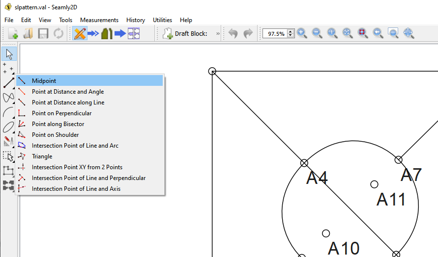
OOh! & what about the Line toolset? Half of the tools in it is a Point placement tool, & the other half establishes a linear relationship between two disparate points, (Though folding it into Curve & Line might be better.) Mostly I don’t like the arrow tool having the chair in a toolbox.
1 Like
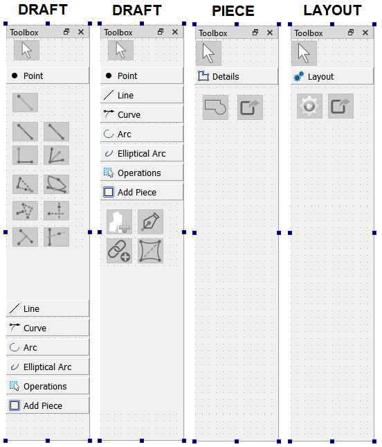
This is something I could do relatively quickly… provided we’re not moving all the tools around. Don’t forget there’s all the menus & toolbars. Separating the the toolbox into 3 is not a big deal. My suggestion is maybe to rename the “Add Details” in draft mode as “Pattern Piece” or just “Piece”, and then the only tab in Piece mode would be “Details”? My reasoning being, you add details to a pattern piece, not a draft block. And the tools that are in the “Add Details” now, while needing to stay in the draft mode, deal with pattern pieces.
Aaah… yup 2 tools. One makes a line, the other 50% makes a point. ![]()
That being said… most of the tools just create a point. Which if we were to put all of them in the Point page, it would get very large, I think it would be even more confusing.
2 Likes
My ha’penny’s worth…
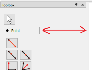
I like all of the suggestions made. And I also think that the Tool Pointer tool doesn’t need to be in each section but rather as a fixture on it’s own above all the sections and not in each section:
And then… I don’t see why the Elliptical Arc tool needs to be in a section on it’s own. It could be in the Arc section, since it is an arc.
1 Like
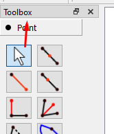
The Toolbox doesn’t work that way… when you select a tab only THAT page is open. It’s possible I could try and put the Arrow above the Toolbox widget. There would be the added benefit of getting rid of more code! Right now there are 10 arrows that need to be maintained… only need one.
I was just thinking the same thing. Only argument might be in the future if other arc tools are added. If you start to put to many items in a given section it starts to get crowed and confusing where items are. It’s like menus… If you start having more than 10 related items it’s time to create a sub menu.
2 Likes
Okay, @slspencer I believe this would fulfill the goal of not confusing the user as to which toolbox to use. But you did bring up the counterpoint that it leaves the toolbars confusing, & since we had a recent question come up, (Need help! Tangent between 2 arcs and any point on them ,) in which a new user had all the toolbars BUT the toolbox open Douglas’s point that new users generally use the toolbox is softened. But since that user appears to be Polish, maybe they just don’t feel a need to have more unfamiliar words cluttering their screen.
1 Like
My opinion, in any case is to keep Draft mode tools separate from Piece tools, and not mix them in the Toolbox, menus or toolbars.
That’s a translation issue… not a UI issue. The solution here is to update the translations, not move tools to have less English words.
1 Like
Ok. Here’s my idea on rearranging the Toolbox dock to adjust to the selected mode, as well as moving the arrow pointer tool out of each page.
For those keeping track… each Dock view would consist of:
MainWindow
  QDockWidget (Toolbox)
    QVBoxLayout
      QStackedWidget
        QToolbutton (arrow)
        QWidget (Draft mode)
          QToolbox (draft tools)
                OR
        QWidget (Piece mode)
          QToolbox (piece tools)
                OR
        QWidget (Layout mode)
          QToolbox (layout tools)
And this can go bye bye only need one arrow pointer…
toolButtonPointerList.append(ui->pointPointer_ToolButton);
toolButtonPointerList.append(ui->linePointer_ToolButton);
toolButtonPointerList.append(ui->curvePointer_ToolButton);
toolButtonPointerList.append(ui->arcPointer_ToolButton);
toolButtonPointerList.append(ui->ellipticalArcPointer_ToolButton);
toolButtonPointerList.append(ui->operationsPointer_ToolButton);
toolButtonPointerList.append(ui->detailsPointer_ToolButton);
toolButtonPointerList.append(ui->piecePointer_ToolButton);

for (auto pointer : toolButtonPointerList)
{
    connect(pointer, &QToolButton::clicked, this, &MainWindow::handleArrowTool);
}
I propose changing the “Add Details” page tab to “Add Piece”, and the “Pattern Piece” to “Details”… reason being you add a (Pattern) Piece from the draft mode, and you add details to a (Pattern) Piece in piece mode. Yes I now that technically add an internal path could be considered a “detail”, but this is one of the idiosyncrasies of the application that you can’t add one in Piece mode. Also keep in mind that the Piece mode → “Details” page will also be populated with other tools such as Text, Symbols, and Buttonholes.
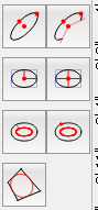
I also would recommend leaving the Elliptical Arc page tab… reason being we may want to add other tools for creating an elliptical arc… such as in QCAD:
3 Likes
It sounds like there has been very good ideas in this thread, and I don’t have much to contribute design-wise. I did want to say though that (speaking as a new user) I think this would help a lot. I have some experience with other CAD software in the past, so I was already familiar with the different “modes” style of operation but even with that foreknowledge the software is a bit overwhelming at first glance. So cutting down some of the clutter by hiding stuff not available in the current mode would help a lot. A similar thing could be done with the shortcuts at the top (currently basically everything is enabled by default) but a lot of that could be cut out of the default configuration and/or hidden based on the current mode (although not sure how hard that would be to implement code-wise).
The other thing I did want to mention that this will help with in a roundabout way is the issue of the minimum vertical size of the main window on the screen. I have a laptop with a somewhat small vertical resolution and the app was too tall to run on the main screen, I had to use a second monitor and run the app over on that monitor to actually use it. The main culprit of this is the toolbar down the side, so dropping a few menus out of each mode would have solved that useability issue.
3 Likes
I really like everything above ![]() And the only reason why I suggested moving the Elliptical Arc to the other Arcs is because it has a whole section all on its own & shares some of the tools in the Arcs.
And the only reason why I suggested moving the Elliptical Arc to the other Arcs is because it has a whole section all on its own & shares some of the tools in the Arcs.
Why does this have to have the word Add tagged on? Why can’t it just be Pattern Piece, since it’s in the drawing mode and holds the tools to create those bits.
1 Like
Vote for both : +1 +1
1 Like
Be more specific… what do you mean “shortcuts” & “everything is enabled”? If you mean the toolbars / docks one can configure to no show those. by right clicking on the (blank) toolbar area and toggle which toolbars are displayed. Not sure if this can be configure to a default on a new install, but I can look into it.
Again… be more specific… are you referring to the toolbars? It would be relatively easy to only show the toolbars that apply in a given mode…
Well… If you refer to the pic I previously posted, that’s exactly what I did… draft mode looses 2 tab pages, and Piece & Layout modes have only 1 tab page each. BTW… the toolbar “down the side” is a Dock… similar to a toolbar widget, but with different properties. I only say this because you can move “toolbars” to the side like:
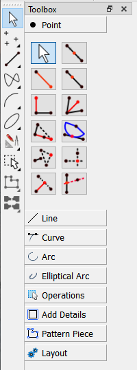
And if you want to get rid of the clutter… toggle off all the tool toolbars and the Toolbox dock except the Toolbox toolbar:
1 Like
Done.
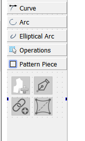
I can move the Elliptical Arc tool to the Arc tab… but like I previously stated - if I end up adding more Elliptical arc tools, I might want to move it back.
2 Likes
Well putting the 3 mode toolboxes in a QStackedWidget works like a charm. Real easy to swap to the correct page in the QStackedWidget when switching modes. Still can’t seem to get the Toolbox tab text labels to expand when resizing the Dock… quite odd. Theoretically I’d like the tabs to expand if for ex one switched to a larger font or set the screen resolution to 125% or 150%… which should expand the QToolbox which should expand the QStackedWidget which should expand the QDockWidget without the tab text eliding.
Anyhow… Just have to resolve a minor issue. Since moving the toolbuttons around and deleting some of the arrow pointer code, the behavior on some of the tools has changed - which IMO might be one of those good accidents - that is the Toolbox stays on the current tool, instead of switching to arrow. I would find it quicker to stay on the same tool, until you WANT to switch, or need to go to the Arrow Pointer. Opinions?
2 Likes
My vote would be yes. Other imaging software do this, too, and I’ve often wished that Seamly does, especially when drawing in lines between nodes ![]()
1 Like
The only possible drawbacks I see are
- getting stuck in a create new layout loop, which seems unlikely since the layout toolbox already doesn’t have the pointer tool,
- if the tools behave differently whether selected from the toolbox or a toolbar.
So, with those caveats which I assume won’t be an issue, (but you know what they say about making assumptions,) I agree with Grace. Yes, this would be a step forward.
1 Like
Sorry for the confusion, yes I mean the toolbars and I know they can be enabled and disabled, I was talking about on the default configuration. When you first open the program it is super overwhelming because literally every tool in the side toolbar is at the top as well, so it is just information overload if you don’t know what all of that is.
As far as making the sidebar shorter, my comment was not meant to be read as something you should do, it was meant to point out an additional benefit to what you already were doing. Hiding some of the top toolbars would have this effect of making the window shorter as well. I just wanted to point it out because the window being so tall is kind of a problem, so if the layout is being redesigned, giving some preference to design choices that shorten the height makes sense.
So, to be clear, I agree with the redesign you were doing, and hope you will take the same approach to the top toolbars that you have on the side bar. (Hiding the ones not relevant to the current mode)
2 Likes
Yes, I hear this feedback often when teaching newbies. The top bar is unusable by newbies and it puts them off a bit, but its great for experienced users.
2 Likes
I don’t see this one as a problem.
The tools behave exactly the same whether called from the toolbox, menus, or toolbars. They are all connected to the same handler for that tool. So again this should not be a problem.
The only problem I forsee… is if a user hid the Toolbox and all the Tool toolbars, and for some reason was just using the menus or keyboard shortcuts. There would be no visual Arrow… although hitting the Esc key triggers the Arrow pointer. I believe switching modes also triggers the Arrow.
1 Like
Again… the “draft mode” toolbox will already be shorter by 2 and 3 pages if I move the Elliptical arc. I’m also trying to put the toolbox in a QScrollArea, which would present scroll bars if you really shorten the main window. At least that’s the idea. The form layouts can be finicky.
I think I can probably hide the tool toolbars as a default… not to be confused by the Dock on the left side. If you want you could move ALL the toolbars to the leftside, top, bottom, or rightside… that’ why I’m specific when I refer to the “Toolbox” dock which can also be move elsewhere or float.
Anyhow. Since toolbars (currently) don’t have to be on a fixed position, there might an issue with hiding certain toolbars when switching modes… and making the toolbars fixed defeats the purpose of being able to configure them. Frankly it would drive me nuts if the toolbars kept moving around. It would be like if the strings on your guitar kept moving.
That being said… Ideally it would great if we could have ONLY the current tool group tookbar - like points - dynamically appear on a bottom row of top position toolbars. The problem here is the way Qt handles the toolbars in the context menu, where it automatically adds toolbars and docks to to the drop down… a user could enable or move another toolbar and throw the whole idea out the window. I would probably have to bypass the Creator UI and code all the toolbar and dock widgets by hand to be able to have control over them… just like the Widget factory in LibreCAD.
1 Like